In this article+

B / Why it matters
The decisive moment usually sits outside the dashboard
A Hong Kong business-services firm offers company secretarial, accounting, IT and recruitment support. Listing all four forces every visitor to choose a starting point. When the homepage prioritises growing 20–100-person companies with limited back-office capacity, the four services become one operating problem rather than four small businesses sharing a page.
A Hong Kong homepage is often copied into a company chat before anyone contacts the business; another person has to decide whether it describes the right problem. A five-person retelling test is therefore more revealing than a neat dwell-time chart. If the summary changes from reader to reader, the page has not made its decision.
The awkward part of a homepage is rarely the sentence-writing. It is the internal bargaining. Every department keeps its line, and the headline becomes a polite meeting note—one-stop, reliable, innovative, apparently everything except clear about who should stay.
The buyer does not decide inside one page. They carry the page into another decision environment.
C / What is actually happening
What the headline number leaves unsaid
Nielsen Norman Group recommends that homepages state who the organisation is, what it does and its unique value; otherwise prospects abandon. ONS content guidance also notes that users scan rather than read linearly, so important information should be frontloaded in sentences, paragraphs and sections.
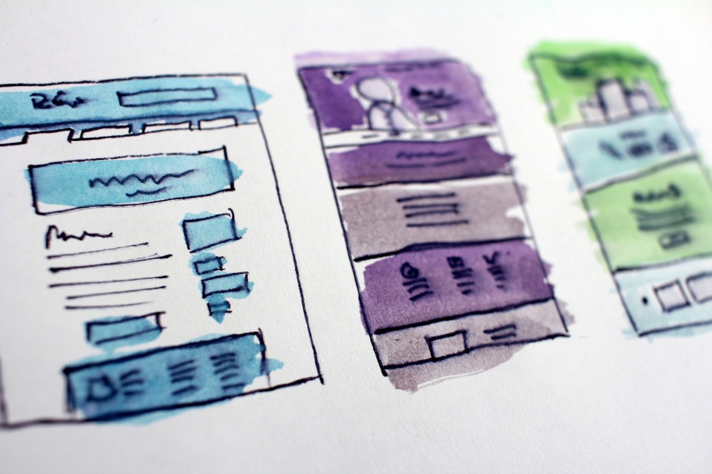
A clear homepage creates hierarchy: principal buyer and outcome first, a small set of connected capabilities next, then evidence and context, followed by next steps for different levels of readiness. If every service, CTA and industry receives equal weight, the page has made no decision.
For Hong Kong professional services, education programmes and technology products, the page often has to survive an internal translation: a visitor explains it to a director, finance colleague or partner before anyone enquires. Adjectives make that explanation heavier, not easier.
D / A practical judgement
A carousel is not a priority decision
Management often adds more words to include more people or uses a carousel to give every department a turn. A carousel is not prioritisation; it hides conflict in time. Most visitors will not wait for the second slide or integrate four competing messages for the company.
A message earns its place when a stranger can scan a few lines and say three things back: who you help, which nuisance you remove, and what happens next. Analytics should test whether that understanding forms; it should not put lipstick on a vague promise.
One counter-question exposes the weakness: if the company offering many services and a buyer knowing which problem to start with, would the decision still hold? When the answer rests only on 'everyone does it', 'our competitor has it', or 'the tool score improved', the evidence is not yet strong enough to spend the next dollar.
The familiar mistake is treating a carousel as a parliament. Every service gets a turn at the top, nobody is actually first, and the visitor will not wait for the company to finish its internal vote before pressing Back.

E / What to do next
The ten-second test for a message
The useful homepage test is not whether it contains enough words. It is whether a stranger can repeat who you help and what problem you solve. Run that test before rearranging headlines or service cards.
Show the homepage to five people who do not know the industry. Give no explanation. After ten seconds ask, 'Who does this company help with what?' A precise answer is a signal; 'looks professional' is a polite way of saying the message missed.
- Show the page for ten seconds to five unfamiliar people and ask each whom the company helps with what.
- Circle every sentence that could appear unchanged on a competitor site; rewrite or remove it.
- Regroup services around one buyer problem rather than the company's departments.
- Assign explicit first, second and third audience priorities rather than equal weight.
- Check whether sales can accurately retell the homepage in one sentence.

F / Limits and conclusion
Several routes do not mean every route at once
A group, platform or marketplace may genuinely support several primary tasks. It can still route clearly by visitor, region or job. Having several choices does not require all of them to demand attention simultaneously.
If several business lines genuinely matter, route them like entrances rather than stacking every doorway in one corridor. Separate contexts, audiences and exclusions are more useful than another sentence claiming the company can do everything.
Clarity does not make the company smaller. It gives the buyer an entrance that can be remembered and repeated; only then can complex capability be understood.
What should survive is not a universal slogan but an opening a buyer can remember and repeat. Once that opening is stable, the team can add proof and products without turning every new paragraph into another layer of fog.
07 / Notes behind the homepage argument
Notes behind the homepage argument
- Nielsen Norman Group: Homepage design principles
- Nielsen Norman Group: Time on page research
- Nielsen Norman Group: First-impression research
These references explain how homepage messages are scanned and judged; the live page still needs validation through Hong Kong buyers, clicks and sales conversations.